js13kGames 2026 Postmortem - PRISM HORN
js13kGames 2026
I joined js13kGames again this year, the jam I have taken part in every year since 2022.
js13kGames is a game jam where you build a game with HTML, CSS, and JavaScript and submit it as a ZIP file no larger than 13KiB. This is my fifth time, so I assumed it would go more smoothly this time… but finishing a game is never easy. And for some reason, whenever I start something like this, work gets busy and the overtime piles up at the same time.
Here are my entries so far.
- 2022 - Death Scythe
- 2023 - 13C Defense
- 2024 - 13 Maze
- 2025 - Grass Tower Defense
This year’s theme was Unicorns and Rainbows. As a Korean, I did not find the theme very relatable.
The first thing that came to mind when I saw the theme was a game where a unicorn shoots rainbow lasers out of its horn. Instead of spending a long time looking for a better idea, I decided to just build the one I already had.
That game became PRISM HORN.
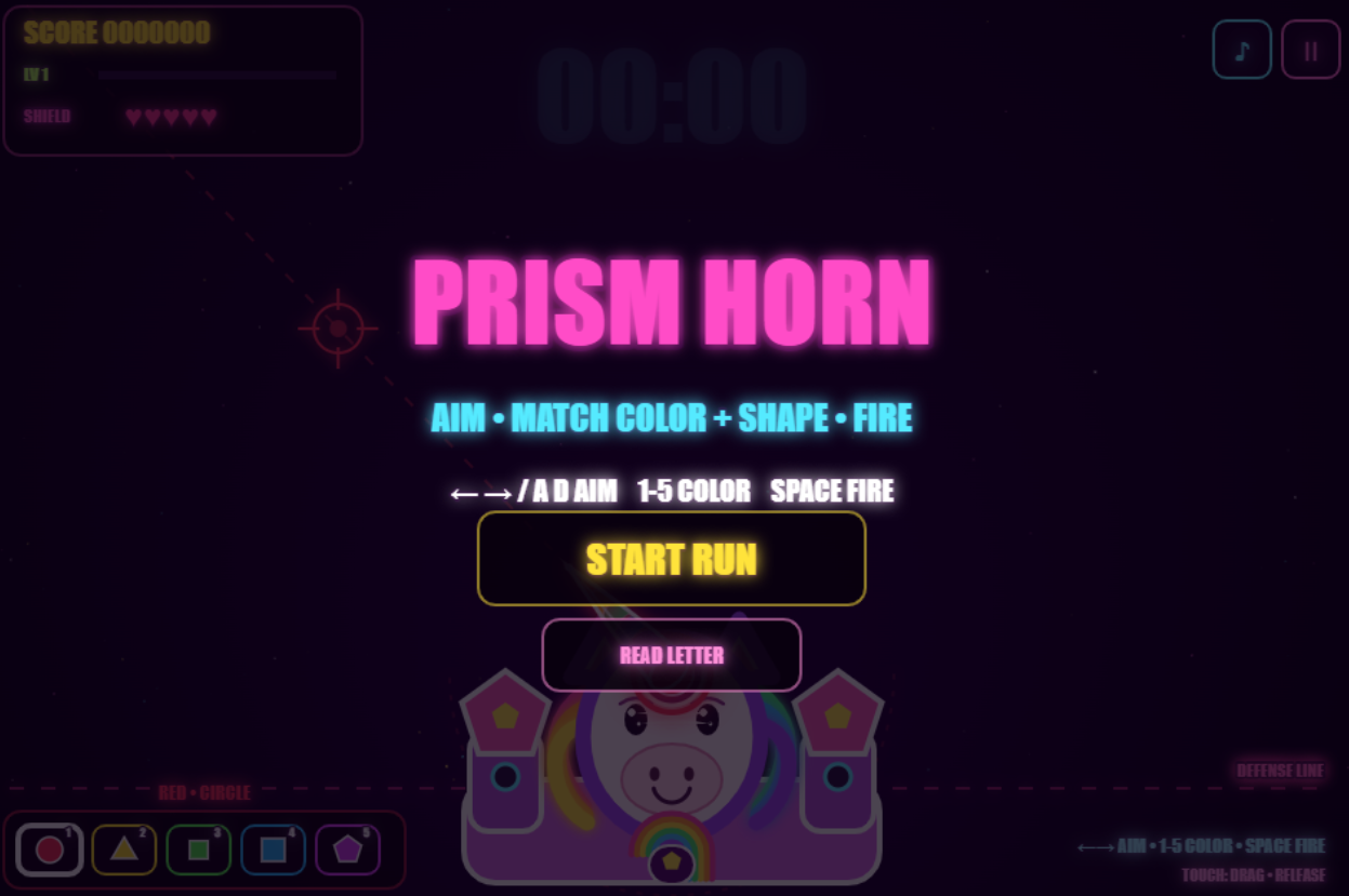
The unicorn at the bottom of the screen does not move. You change the direction of the horn and the color of the laser to stop the enemies coming down from above. You have to hit an enemy with a matching color, and if an enemy reaches the defense line at the bottom, your shield drops.
The submission page is js13kGames - PRISM HORN.
The first version was not fun
At first, the horn fired five lasers at once - red, yellow, green, blue, and purple.
It looked great. It seemed to fit the theme well. But when I actually played it, all I had to do was wave the horn left and right. Every color was firing all the time, so there was no reason to pick a color and no reason to think about which enemy to take out first.
It looked like a game, but there was nothing to do in it.
So I removed the five lasers and made the horn fire a single color at a time. You switch colors with the number keys or Q/E, aim, and then shoot. Not being able to see where you are aiming was too frustrating, so I added a thin aiming line as well.
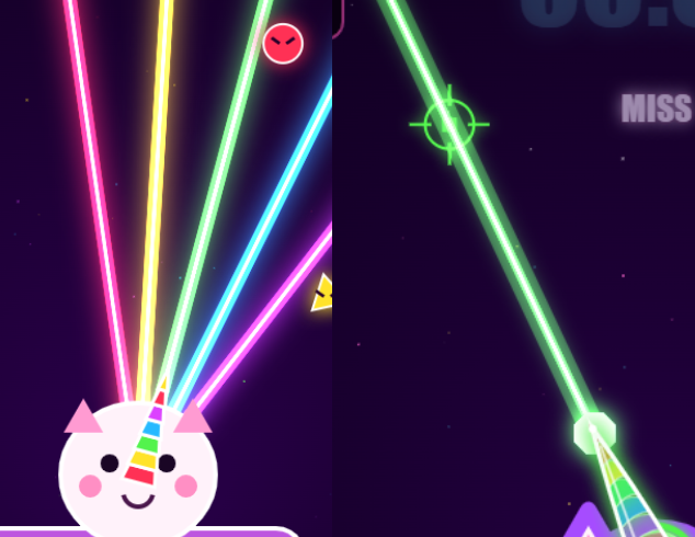
The five-way laser was far flashier, but it only started to feel like a game after I made the player choose one color at a time.
I could not hit enemies that got too close
The unicorn is a fixed turret, so it cannot move. I made only the horn rotate left and right, and at first I limited the angle fairly tightly so the horn would not swing through the body.
The problem was that when an enemy came down along the edge of the screen, there was no way to attack it even before it reached the defense line. The horn simply would not turn any further, so all I could do was watch my shield drop.
Widening the angle limit made the horn attach to the head awkwardly, and keeping the limit made the game feel unfair. In the end I rounded off the base of the horn and widened the rotation range. I also added a small correction to the aim check for enemies that get close to the defense line.
A game being hard and a game being impossible to control are two different problems, so I ended up revising this part quite a few times.
It looked like a pig, not a unicorn
All the graphics are drawn with Canvas shapes, with no image files.
The first unicorn I drew had a face that was too round and a snout that was too short, so it kept looking like a pig. I moved the ears around, made the face a bit longer, and split the muzzle and the bridge of the nose into separate shapes. It was mostly grunt work. I am not good at coordinate math, so it was a loop of tweak, look, tweak, look.
The horn is the most important part of the game, so I gave it segments in different colors and made it glow when firing. I also added a round pivot at the base so the rotation would look less awkward.
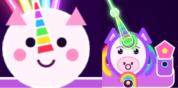
Images would have looked nicer, but given the size limit, drawing shapes seemed like the better trade. The downside was that every time I trimmed code, I had to check that the unicorn had not lost an ear or its horn.
Adding roguelike upgrades
Just matching colors and shooting got repetitive fast. So I added a roguelike layer: enemies drop experience, and on level up, you pick one of three upgrades.
At first most of the upgrades were just numbers going up, like fire rate or attack range. The player really was getting stronger, but it was hard to notice while playing.
So I added abilities you can actually see on screen.
- Color portals that fire automatically on a timer
- Upgrades that split the laser into two or three beams
- An upgrade that mixes multiple colors into a single laser
- Attack speed, attack range, slow, and shield upgrades
- Synergies that appear when certain upgrades are combined
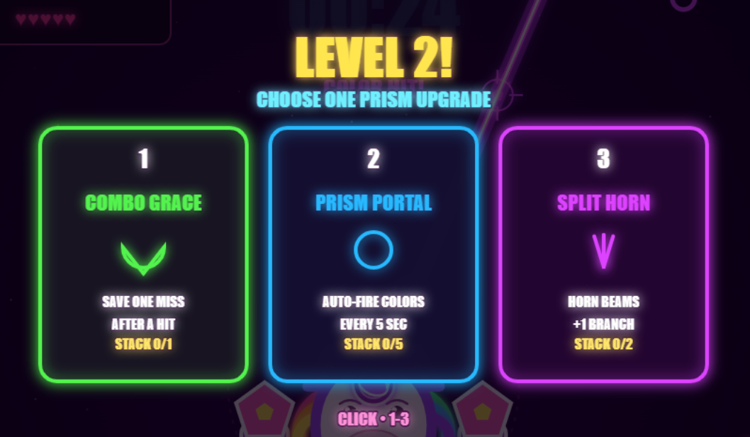
Once picking an upgrade could spawn a portal, split the laser, or let you hit several colors at once, it finally felt like my build was getting stronger over the run, the way a roguelike should.
When the upgrade cards were fully random, there were runs where not a single attack upgrade showed up. Now at least one attack-related card always appears, and healing cards show up a little more often when your shield is low.
Enemies overlapped and the screen got messy
Spawning enemies at random positions meant several of them often piled up in the same spot. With different colors and shapes stacked on top of each other, it was hard to even tell which color to attack with.
I changed normal enemies to spawn into whichever of the seven invisible lanes is free. On top of that, I added deliberate formations - three enemies of the same color in a vertical line, or all five colors side by side.
Random enemies overlapping was hard to read, but hitting a deliberately lined-up group in one shot was fun. The two look like the same thing on screen, but one was a bug and the other was a pattern built for combos.
Scaling the difficulty was harder than I expected too. When I raised enemy speed, spawn rate, and elite chance all together, the game suddenly became unmanageable partway through. Now there is a cap on how many enemies can be on screen, and a short break with no spawns after a boss is defeated.
Bosses
The first boss is there to teach you to break color shields in order. It comes down slowly through the middle of the screen, and you have to attack with the color of its current shield.
The first version of that boss was too slow and had too few shields, so it spent a long time drifting down and then died immediately. I gave the first boss some slack since it is the tutorial one, and from the second boss on they move quickly left and right as they descend. Later bosses have more shields.
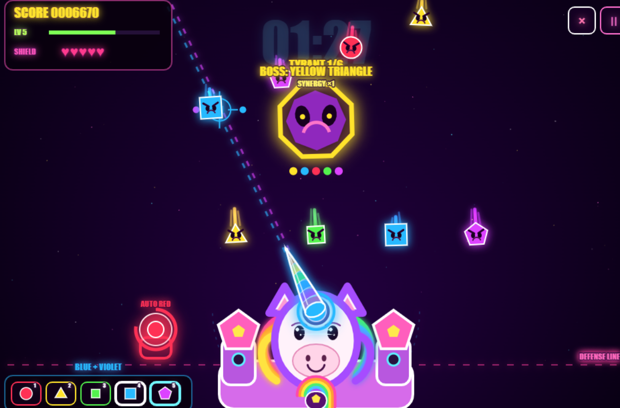
Beating a boss lets you pick one reward from a set that is stronger than the normal level-up options. If a boss is too weak, the reward feels free, and if it is too fast, the fight ends before you can even switch colors, so I will probably keep tuning this part until submission.
Sound and 13KiB
I used no image or audio files. The graphics are drawn with Canvas 2D, and the background music and sound effects are generated with Web Audio API oscillators.
In an earlier entry I used mp3 sound effects and had to degrade the quality badly to fit the size limit. With no audio files this time, that problem was gone, but the code-generated background music was so quiet that for a while you could barely hear anything.
During development I worked in a readable game.js and ran it through Terser when building the submission file. Add a feature, minify, go a few bytes over, cut some text or duplicated code, minify again - over and over.
The ZIP is currently 13,304 bytes. The 13KiB limit is 13,312 bytes, so there are 8 bytes left. That sounds tight, but after years of squeezing images in, dropping them entirely made the budget feel surprisingly roomy.
I still remember lowering image resolutions and shaving code every single year.
Wrapping up
I started with the idea that rainbow lasers from a unicorn horn would fit the theme well and be simple to build.
But firing all five colors at once was not fun, and making the player pick colors one at a time made it too hard. Adding lots of upgrades erased the core mechanic, and adding lots of enemies made the screen unreadable. Fixing one thing broke another, so “kept adjusting it” describes the process better than “kept building it.”
Even so, compared to my previous entries, this one has more of the basic structure in place - a title screen, game over, bosses, and level ups.
Drawing a unicorn with Canvas turned out to be more fun than I expected, and so did seeing how much I could fit inside 13KiB.
My goal is to place in the top 100 and get the swag. We will see how that goes.
Personally, ever since my js13kGames badge fell off my bag and I lost it, I have badly wanted another one… last year it was dice… maybe badges are not part of the swag anymore. I miss that lost badge more than ever.